


Some covers are more symbolic. Some covers focus on a particular aspect of or event within the story. Some, like this one, seem to directly reflect the book’s description of an epic, swash-buckling adventure. What factors go into selecting a particular image? How closely should the image reflect the actual story or particular elements of the story?
Lou Anders: The most important job for a book cover is that it connects the right book with the right reader. I’ve likened book covers in the past to the patterns and colors of different flowering plants, signalling to the appropriate insects “This is the flower you want; stay away from that one over there. Try this!” Book covers have about thirty seconds or less to catch the casual bookstore browser’s eye, and if they can’t do that, then it doesn’t matter how attractive they are. In fact, before the book ever reaches the shelf, its first (and arguably most important) audience is the book buyer who determines how many copies to buy for his/her store. At Barnes & Noble, that’s one individual, who buys for all of science fiction and fantasy nationally. I think it is wonderful when a book cover depicts its contents accurately and in line with its author’s intent, and we always strive for this, but an accurate representation of the contents is not as important as an accurate presentation of the type of experience the book promises. The most important consideration is that the book cover accurately indicates the promise of the book. That’s it right there. The book cover is a promise, and we need to keep that promise. In this particularly case, a lot of directions were tried and discarded, because, although they were wonderful pieces of art in their own right, they promised a different experience from the one Mark’s story provided.
 |
| Behind the scenes |
Mark Smylie: There’s obviously a huge range in terms of sf/fantasy covers, though I think the range in fantasy tends to be a bit more narrow. If it works, The Barrow is a novel about some pretty grim and gritty characters doing some very dangerous and dirty work; I won’t go so far as to call it grimdark, I wasn’t even aware of that term until recently, but if it winds up with that label I don’t think I’d object too hard. It’s kind of like an archetypal Dungeons & Dragons adventure as run through the filter of Lock Stock and Two Smoking Barrels: a predominantly street-level view of the world, loaded with (casual) violence and tension and hopefully some unexpected twists. There are all sorts of other themes and layers that run through the book – well, there are if I was successful as a writer, that is – such as the fate of women in a medieval-style patriarchal culture, the question of who you trust and why, how you decide what you’re loyal to, how history and lineage are bound up in a present reality. I think when Lou and I were initially discussing cover ideas we had discussed a fairly wide range of cover concepts, with some of them hitting more on some of those additional themes and elements rather than focusing on the main vibe of the book. But in the end Lou thought it would be best to really emphasize that gritty quest-narrative that drives the book, and I think the result is spot-on.
How much editorial input is there prior to and during the design process? Does an editor see the design before it is complete? Does the editor have input on what it should look like?
Lou Anders: In this case, I am both Editorial Director and Art Director of Pyr, so yes. This editor commissions the artist, communicates the art brief, views the roughs and art directs the entire process. I also oversea the work of our three very talented in-house designers (Jacqueline Nasso Cooke, Nicole Sommer-Lecht, and Grace M. Conti-Zilsberger).
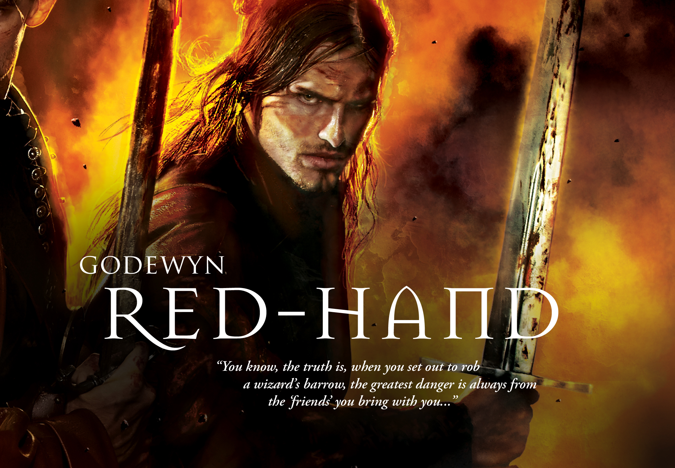
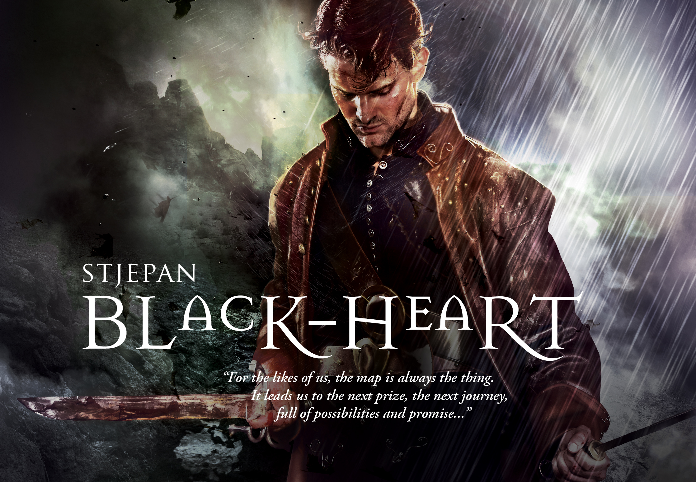
Gene Mollica: I was really fortunate with this project because I got a lot more than just the usual brief overview; I had the pleasure of working with two very visual people who like to be hands on. Lou knew very well what he needed and what visual directions to take. Mark is a fabulous artist and provided very clear illustrations and descriptions of each of the characters.
Together we made a great team, as we continued to nail down and refine the concept. We reviewed models / talent for the photography; once we picked the talent, we then discussed wardrobe carefully so that I could start designing the costumes (all of the wardrobes for the characters were custom made by my fabulous costumer).
It got really fun when we realized that both Mark and I lived just minutes from each other – that called for a face to face throw down of who has the best weapons in their arsenal. Mark won, incredibly convenient that he’s also a collector of fine rare medieval weapons. So like two big kids we got into the costumes, weapons, baldric, belts, knives and swords – work life doesn’t get better than this.
So this assignment was a hell of lot of fun, rarely do you get this much direct insight from an editor and the author. Together, hopefully we achieved a great cover.

As an artist yourself, Mark, did you consider doing the cover? Why or why not? How much input did you have on the process? How do you feel about the end result?
Mark Smylie: Lou actually asked me early on if I wanted to do the cover; I think he assumed the answer would be yes. But I declined. My art style uses a mix of watercolor, colored pencil, and ink line, and I think it works well in comics or in roleplaying game illustrations but maybe less so in the realm of sf/fantasy book covers, which tend to be either painterly, photorealistic, or very design-oriented.
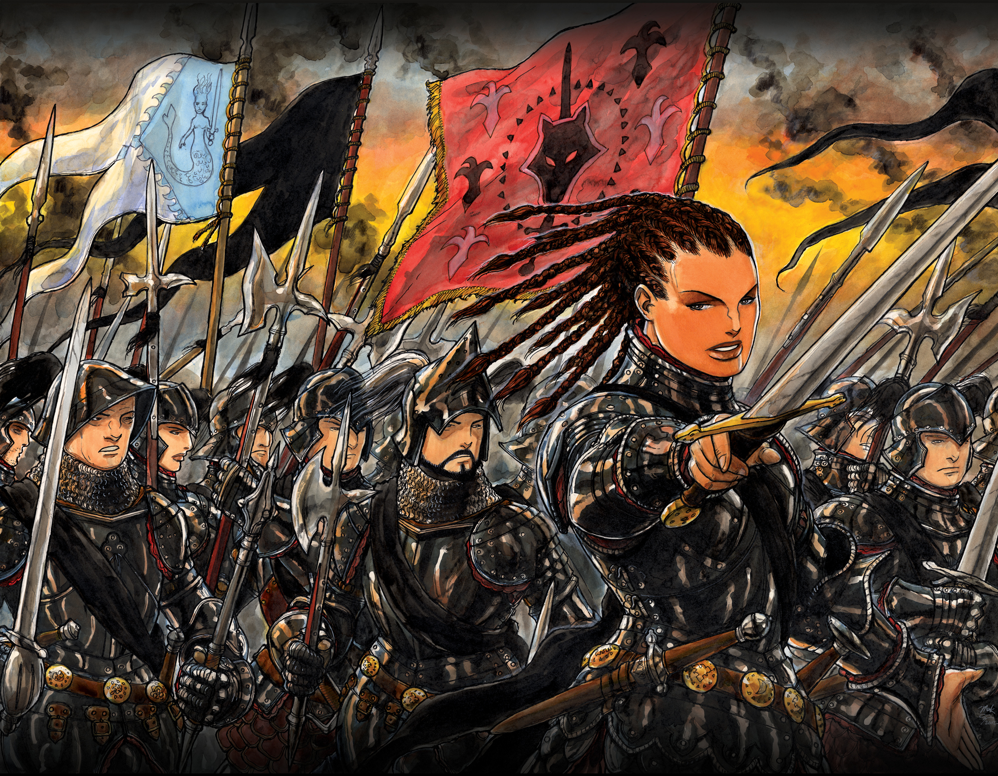 |
| Mark Smylie's Artesia |


This is like the coolest interview ever, Wendy! Covers play such a huge role in attracting readers to a book, but so rarely do we get to read about the details on all the work that must go into them.
ReplyDeleteYou should go peek at the next one ;-)
DeleteNothing much to say but thank you, I enjoyed this interview quite a bit.
ReplyDeleteGlad you enjoyed it!
DeleteI know this is older but now I have read the book. And while Black Heart looks like I picture him, the other two are nothing like my idea.
ReplyDeleteSame, not surprisingly they're all much more attractive than the book makes them sound and Erim looks way more feminine than described.
Delete