The BiblioSanctum has moved!

You will be automatically redirected to the new address in 5 seconds. If that does not occur, please visit
http://www.bibliosanctum.com
and update your bookmarks. See you at our new home!

Showing posts with label Gene Mollica. Show all posts

Monday, January 27, 2014

Step-by-Step with Cover Illustrator Gene Mollica

There's a good chance that, if you're a Science Fiction, Fantasy, Steampunk and Urban Fantasy reader, you've read a book featuring one of Photo-Illustrator Gene Mollica's incredible covers. A graduate of the Rhode Island School of Design (RISD), Gene began his artistic career as a traditional painter, but soon moved into the challenging world of digital media.

When chatting with Gene, one thing becomes very clear: creating the most stunning image possible is his goal, and he goes above and beyond to make that happen. The wrong cover can confuse an audience, so it's Gene's job to make sure that his work is not only eye-catching, but captures the attention of the right readers. The key is visually interesting texture and detail to "anchor the eye," while still encouraging movement across the page. And of course, the image should reflect the story within.

"I put a little something of myself in every cover," says Gene.

The result is beautiful images that offer a window into an author's world. And the best part is that he absolutely loves doing it and loves chatting about it.

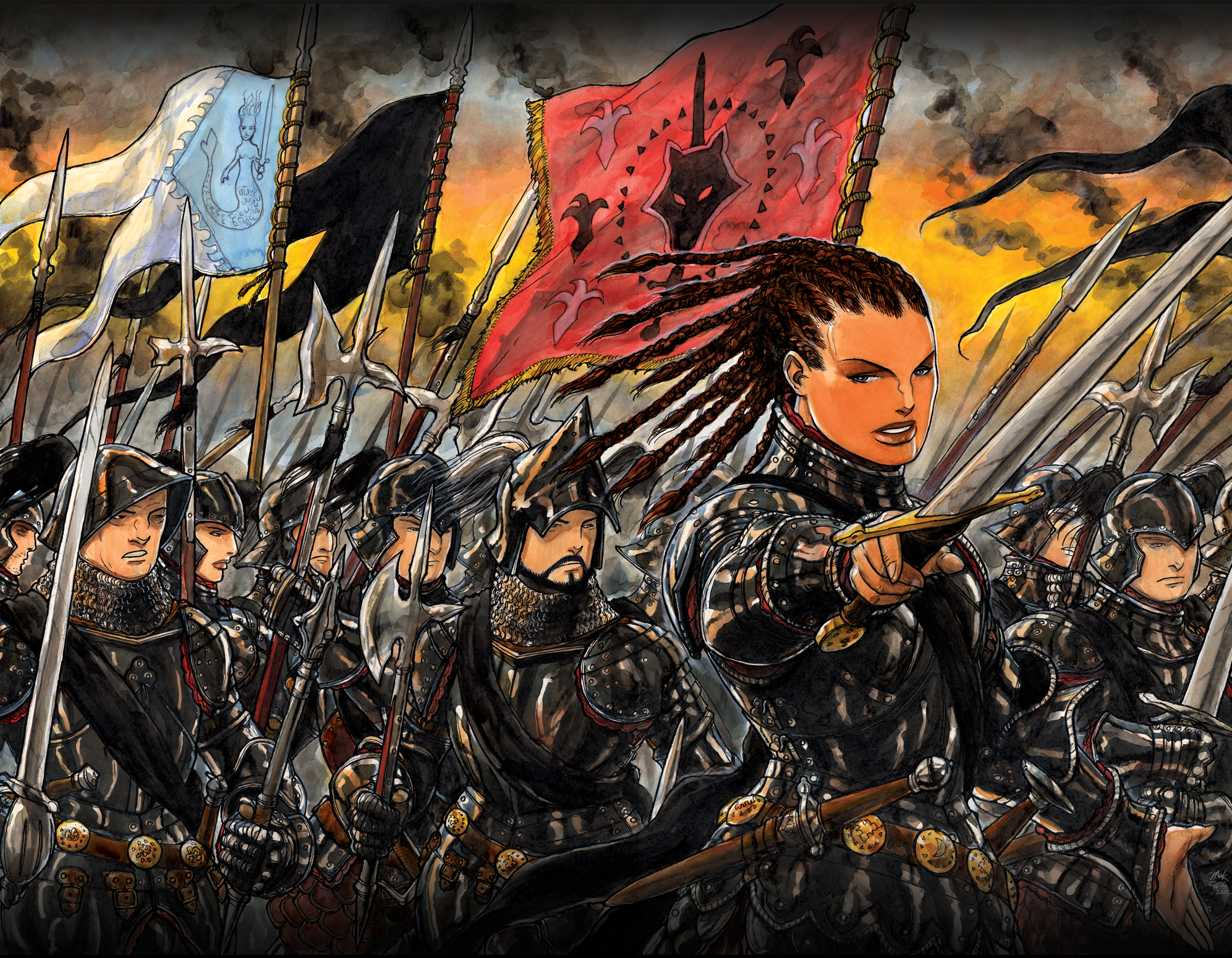
The Crimson Campain by
Brian McClellan
We learned a little about the cover design process in our recent Cover Lover, featuring Mark Smylie's The Barrow, but Gene very kindly offered to go deeper, taking us through the steps that bring his brilliant covers to life.

STEP ONE: The brief. 

There are many important factors that go into the design beyond the outline of story and characters. The current market trend and competing books within the genre need to be considered, which is why it is important to find what makes an individual book unique and bring that to light in the cover.

The information a cover designer receives from an editor/art director can be quite sparse, and when Gene first began in the industry, this was an obvious challenge. Now that experience has made him far more confident, he readily pushes back to the art direct/editor to request more detail. Authors have also found that his friendly and receptive nature, and his desire to truly understand their vision, means they can really get down to the defining details. Does the character have a tattoo? What kind of attitude and expression would they have? Are they wearing a specific style or piece of clothing?

Lena Greenwood from Codex Born
The visual challenges Gene deals with can be as basic as those in Brian McClellan's Powder Mage series, which required a civil war costume with a medieval background. Or they can be far more intimidating, such as working on the notorious Jim C. Hines' Magic Ex Libris series. Gene says that he's learned a lot from Hines' critical analysis of the posing of female characters. Codex Born, the second book in the series, presented a real challenge based on the character description of a Native woman of a larger body type. "Oh it was terrifying!" Gene laughs, but fortunately, Hines was pleased with the end result.

STEP TWO: Agreement on a desired direction.

Through thorough back and forth discussions with the art directors, editors and/or the authors, Gene is able to put together some rough sketches for approval, before getting down to business.

STEP THREE:  Pre-production.


"I love the costume part," says Gene. Many of his covers are for the Urban Fantasy genre, featuring jeans and tank tops, but he really gets to have fun with Fantasy. Then Steampunk came along and opened up a whole new world.

Initially, Gene attempted to rent all the costumes, but discovered that rental shops tend to fulfill the more robust demands of theatrical costuming. Now, he works with professional costume designers and his growing collection of weapons and gadgets to get the perfect look.

Gyllian of Eeldrytch Armouree is a critical member of Gene's team. He handles all of the leather pieces, belts, baldrics and customizes the weapons. Gene also works with the fabulous design team of Shirley and Victor Forster of Renaissance Sewing, but Deborah Gerard has become his lead after years of working together on Gene's many projects, from start to finish. "I totally rely on her expertise and thorough knowledge of historical costumes and traditions. Her design capabilities experience and versatility across a wide spectrum has really brought my work up to a new level."

Looking for a custom designed costume based on the cover of your favourite novel? All of these gorgeous designs can be recreated!
Once the props and costumes have been chosen, it's time to select the talent. Gene's preference is to work with professional talent agencies which, while a bit more costly, has the advantage of filtering talent that is the most suitable to his needs.
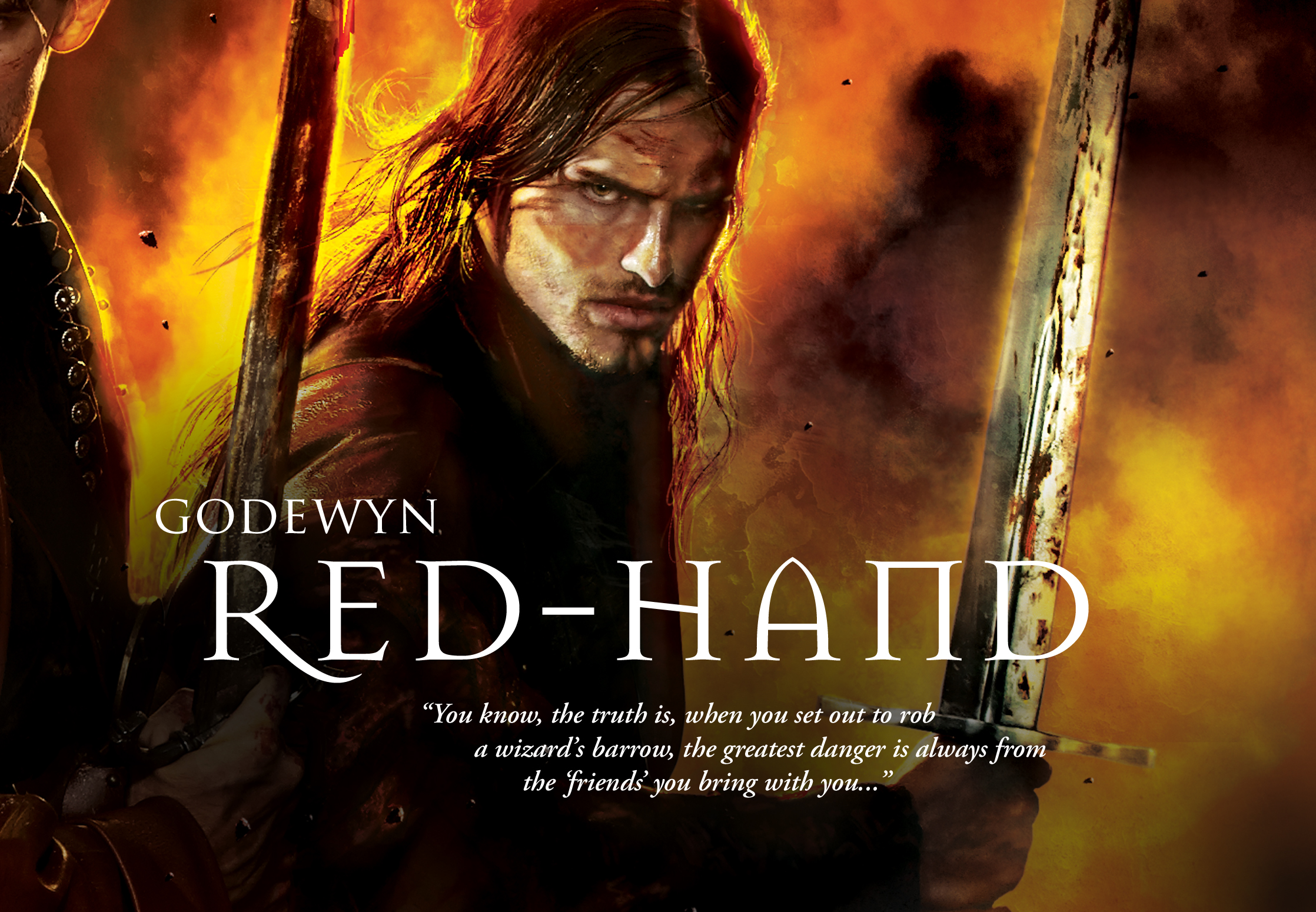
Experience has taught him a lot when it comes to finding the right talent. Even something as seemingly small as an inability to smirk can ruin a photo shoot if the model is unable to bring the right attitude to the character. Conversely, while he had not worked with them before, Gene felt he really lucked out with the three models used on the cover of The Barrow.

STEP FOUR:  The photo shoot. 

With the costumes, props and talent in place, and a quick review with the art director again, the process advances to the photo shoot where Gene rounds out his team with his, assistant, Mike Moosbrugger, who's knowledge of professional studio lighting and work flow is exceptional. And on-set stylist Agata Smentek transforms the models with her fantastic hair and make-up.

Then the stage is set and the photo shoot begins. Gene used to direct the them himself, but "it made me crazy not to have that control," so in July 2013, he invested in his own Canon 5D Mark II camera to expand his creative talents into the realm of photography. "The camera is a tool that I wanted to understand better," he says. The transition makes sense for a man who is always looking toward the future. With book trailers becoming very popular, video shoots might be the next big thing and Gene plans to be right on top of it.

STEP FIVE: Composites.

Wolfbreed by S.A. Swan
Once pictures from the photo shoot are approved, Gene creates some quick composites and rough images for review. He used to provide ten or twelve comps, but, as with all processes, experience allows for a lot of streamlining. With a firm understanding of the direction the cover needs to go, Gene is able to rough in the background and foreground colour palette to create just a few high resolution comps that are very close to the final product.

STEP SIX: Final illustration.

Finally, working in Photoshop with stock photos - a mountain from here, a tree from there - Gene creates his masterpiece - a seamless blend of colour, lighting and design to catch the eye of the reader.

***

I'd like to take the opportunity to thank Gene for our delightful chat. I'm definitely looking forward to reading more books featuring his amazing cover design and can't wait to see what he's working on next.  Be sure to visit Gene's website at www.genemollica.com or say hello at Gene Mollica Studio on Facebook.

Thursday, January 16, 2014

COVER LOVER: Behind the Scenes with The Barrow

Cover Lover is a feature originally created by our friend and fellow book blogger, Jaedia at Once Upon A Time. Usually, we chat about covers that strike our fancy, of which The Barrow's cover most definitely is one, but Eisner award nominated Author and Artist Mark Smylie, Pyr®'s award-winning Editorial and Art Director Lou Anders and the incredible scifi/fantasy cover Illustrator Gene Mollica have graciously helped me take this feature one giant step further by offering us some insight on the cover design process.

Some covers are more symbolic. Some covers focus on a particular aspect of or event within the story. Some, like this one, seem to directly reflect the book’s description of an epic, swash-buckling adventure. What factors go into selecting a particular image? How closely should the image reflect the actual story or particular elements of the story?  

Lou Anders: The most important job for a book cover is that it connects the right book with the right reader. I’ve likened book covers in the past to the patterns and colors of different flowering plants, signalling to the appropriate insects “This is the flower you want; stay away from that one over there. Try this!” Book covers have about thirty seconds or less to catch the casual bookstore browser’s eye, and if they can’t do that, then it doesn’t matter how attractive they are. In fact, before the book ever reaches the shelf, its first (and arguably most important) audience is the book buyer who determines how many copies to buy for his/her store. At Barnes & Noble, that’s one individual, who buys for all of science fiction and fantasy nationally.  I think it is wonderful when a book cover depicts its contents accurately and in line with its author’s intent, and we always strive for this, but an accurate representation of the contents is not as important as an accurate presentation of the type of experience the book promises. The most important consideration is that the book cover accurately indicates the promise of the book. That’s it right there. The book cover is a promise, and we need to keep that promise.  In this particularly case, a lot of directions were tried and discarded, because, although they were wonderful pieces of art in their own right, they promised a different experience from the one Mark’s story provided.

Behind the scenes
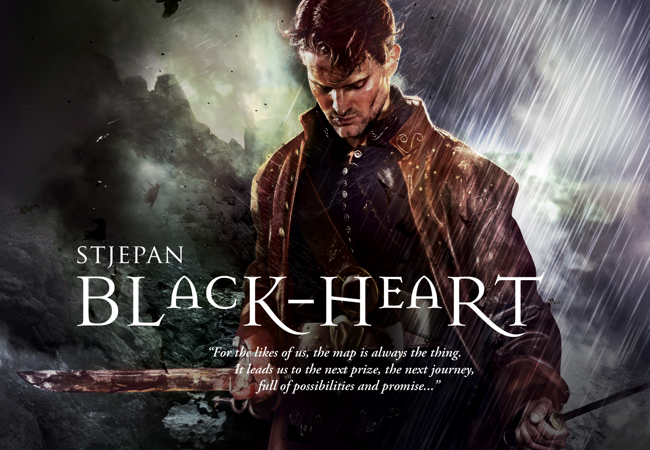
Gene Mollica: To be honest, the decision as to what kind of image is best for a certain book usually happens before it gets to me, the artist - it's made by the editors, art directors, and publishers based on what they think is most powerful about the book, the market they're going after, and hopefully some input from the author. Then, they call me with a description, and I concept and create the image - the model, the clothes, the pose, the setting, and the mood. There are all kinds of covers in science fiction/fantasy - I tend to like the ones that are more photographic or photo-real appearing, and dramatically lit. For The Barrow, I had the opportunity to work very closely with both the editor and the author, which doesn't always happen - Mark actually lives nearby so he came to my office and I showed him my ideas, some models, and the costume design before we did the shoot. I really wanted to bring the gritty tone and the characters to life and I'm pretty happy with the way it turned out.

Mark Smylie:  There’s obviously a huge range in terms of sf/fantasy covers, though I think the range in fantasy tends to be a bit more narrow.  If it works, The Barrow is a novel about some pretty grim and gritty characters doing some very dangerous and dirty work; I won’t go so far as to call it grimdark, I wasn’t even aware of that term until recently, but if it winds up with that label I don’t think I’d object too hard.  It’s kind of like an archetypal Dungeons & Dragons adventure as run through the filter of Lock Stock and Two Smoking Barrels: a predominantly street-level view of the world, loaded with (casual) violence and tension and hopefully some unexpected twists.  There are all sorts of other themes and layers that run through the book – well, there are if I was successful as a writer, that is – such as the fate of women in a medieval-style patriarchal culture, the question of who you trust and why, how you decide what you’re loyal to, how history and lineage are bound up in a present reality.  I think when Lou and I were initially discussing cover ideas we had discussed a fairly wide range of cover concepts, with some of them hitting more on some of those additional themes and elements rather than focusing on the main vibe of the book.  But in the end Lou thought it would be best to really emphasize that gritty quest-narrative that drives the book, and I think the result is spot-on.

How much editorial input is there prior to and during the design process? Does an editor see the design before it is complete? Does the editor have input on what it should look like?

Lou Anders: In this case, I am both Editorial Director and Art Director of Pyr, so yes. This editor commissions the artist, communicates the art brief, views the roughs and art directs the entire process. I also oversea the work of our three very talented in-house designers (Jacqueline Nasso Cooke, Nicole Sommer-Lecht, and Grace M. Conti-Zilsberger).

Gene, what information do you get to work with in order to create a cover? Do you read the story itself, or are you just provided an overview? 

Gene Mollica:  I was really fortunate with this project because I got a lot more than just the usual brief overview; I had the pleasure of working with two very visual people who like to be hands on. Lou knew very well what he needed and what visual directions to take. Mark is a fabulous artist and provided very clear illustrations and descriptions of each of the characters.
Together we made a great team, as we continued to nail down and refine the concept. We reviewed models / talent for the photography; once we picked the talent, we then discussed wardrobe carefully so that I could start designing the costumes (all of the wardrobes for the characters were custom made by my fabulous costumer).

It got really fun when we realized that both Mark and I lived just minutes from each other – that called for a face to face throw down of who has the best weapons in their arsenal. Mark won, incredibly convenient that he’s also a collector of fine rare medieval weapons. So like two big kids we got into the costumes, weapons, baldric, belts, knives and swords – work life doesn’t get better than this.

So this assignment was a hell of lot of fun, rarely do you get this much direct insight from an editor and the author. Together, hopefully we achieved a great cover.

Mark Smylie:  I might take issue with Gene saying I won the arsenal contest.  Gene’s got a great collection of weapons and props, certainly far more pieces than I do, and I even had a bit of a geek moment when I spotted the sword he used for the cover of Joe Abercrombie’s Best Served Cold (which I believe wound up being used as Erim’s sword on the cover, though you don’t really get a look at the hilt; there are other pictures from the studio shoot where you can see that it’s the same sword).

As an artist yourself, Mark, did you consider doing the cover? Why or why not? How much input did you have on the process? How do you feel about the end result?

Mark Smylie:  Lou actually asked me early on if I wanted to do the cover; I think he assumed the answer would be yes.  But I declined.  My art style uses a mix of watercolor, colored pencil, and ink line, and I think it works well in comics or in roleplaying game illustrations but maybe less so in the realm of sf/fantasy book covers, which tend to be either painterly, photorealistic, or very design-oriented.
Mark Smylie's Artesia
Since I come out of comics and graphic novels as a writer/creator/illustrator, I wanted there to be a clear message to the reader: this is a fantasy novel.  It’s not a graphic novel in disguise, or somehow translated into a prose work (well, okay, technically it was a screenplay first; but it was never intended to be a comic).  So I thought it was important to have someone do the cover who could give it that feeling of “hey, look, it’s an actual fantasy novel.”  Lou and I kicked some ideas around – I think the only stipulation I asked was that it couldn’t be someone that I already knew – and at one point he suggested Gene.  I had seen a number of Gene’s covers (such as the cover he did for Best Served Cold, and for Brian McClennan’s Promise of Blood and the Powder Mage series) and really loved the idea of a sharp, photorealistic style to it.  I was able to provide some details and sketches and sample photos as a kind of look-book for the characters and their equipment, and then as Gene mentioned since it turned out we lived not too far from each other I was able to pop over to his studio and take a look at some of the available weapons and costume choices.  With the comic I’ve always tried to inject realism into the armor and weaponry and costuming, and Gene and his costumer have a great sense of how to mix fantasy and historical elements in the look of the character’s clothes.  It was fun to be asked to be involved in the process and I really loved Gene’s end result (so much so that I asked Gene to do individual character portraits that I am using on the book’s website, at www.swordandbarrow.com).